Signature Branding Projects
My main discipline lies in branding, where I focus on creating strong, cohesive visual identities. At the same time, I explore and contribute to many other creative fields, bringing versatility and fresh perspectives to my work!
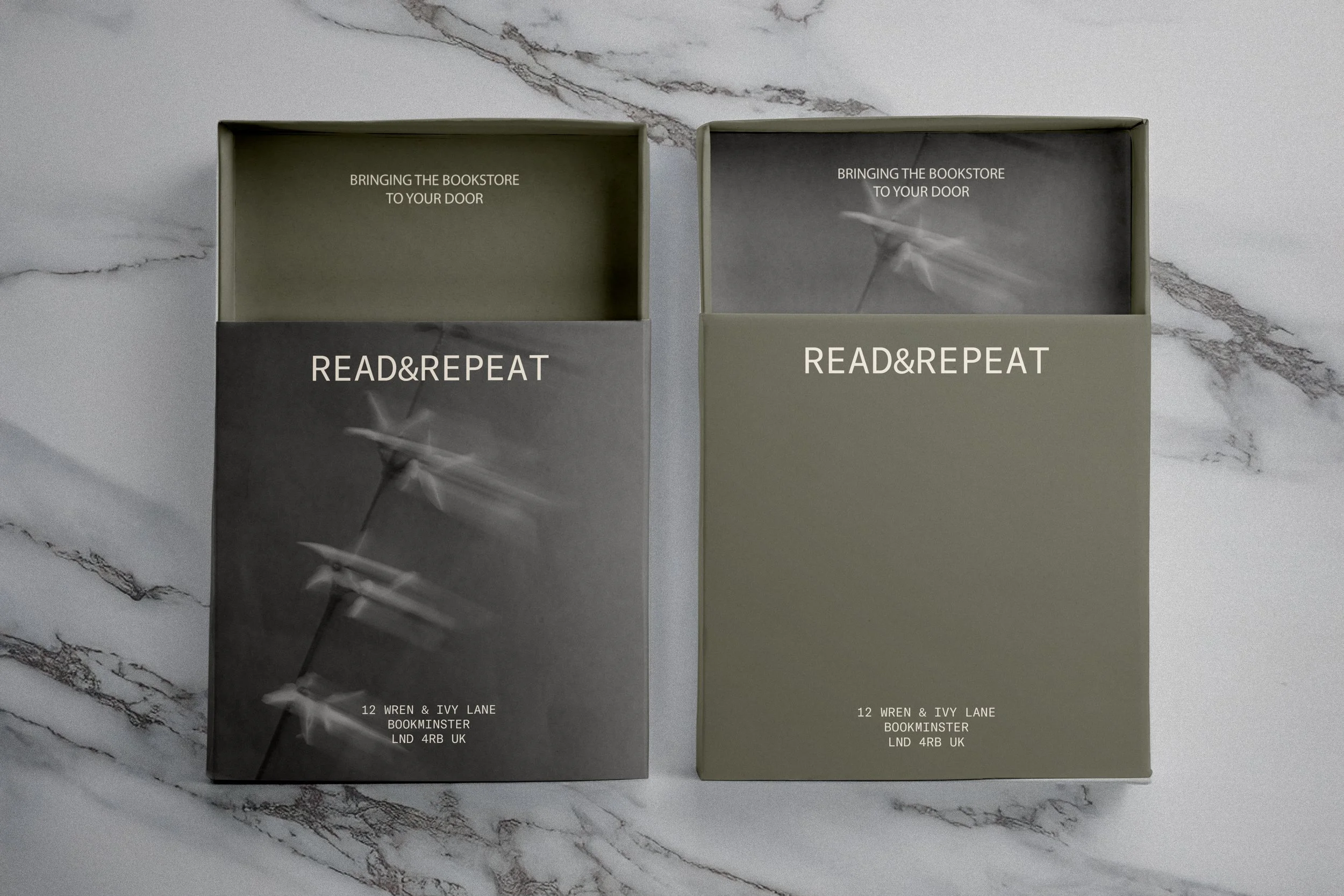
READ & REPEAT
Celebrating the quiet joy of slow, intimate reading.
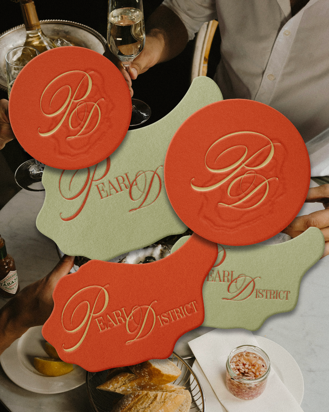
PEARL DISTRICT
Modern seaside dining, rendered in texture and detail.
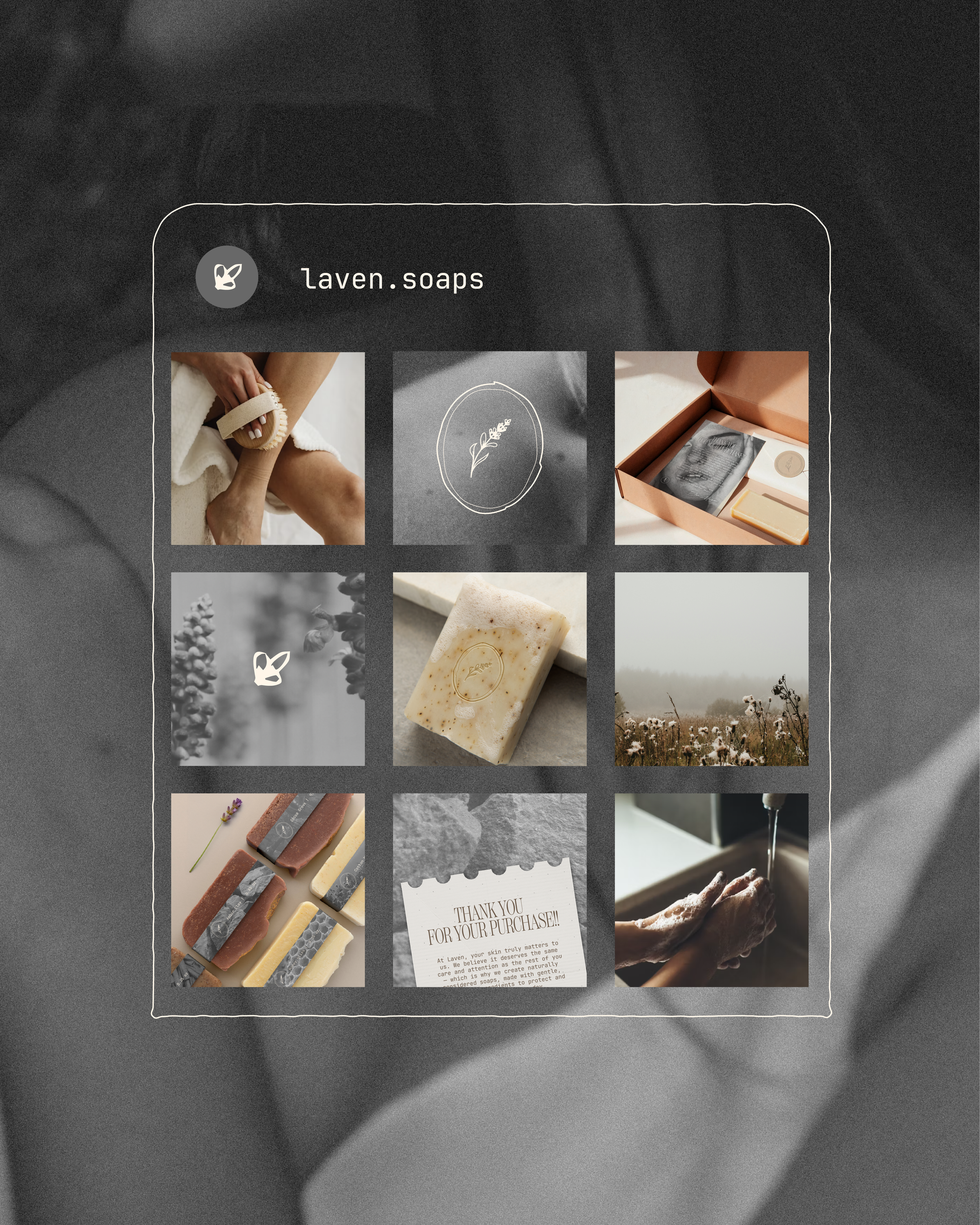
LAVEN
Organic soaps made for every skin, every day.
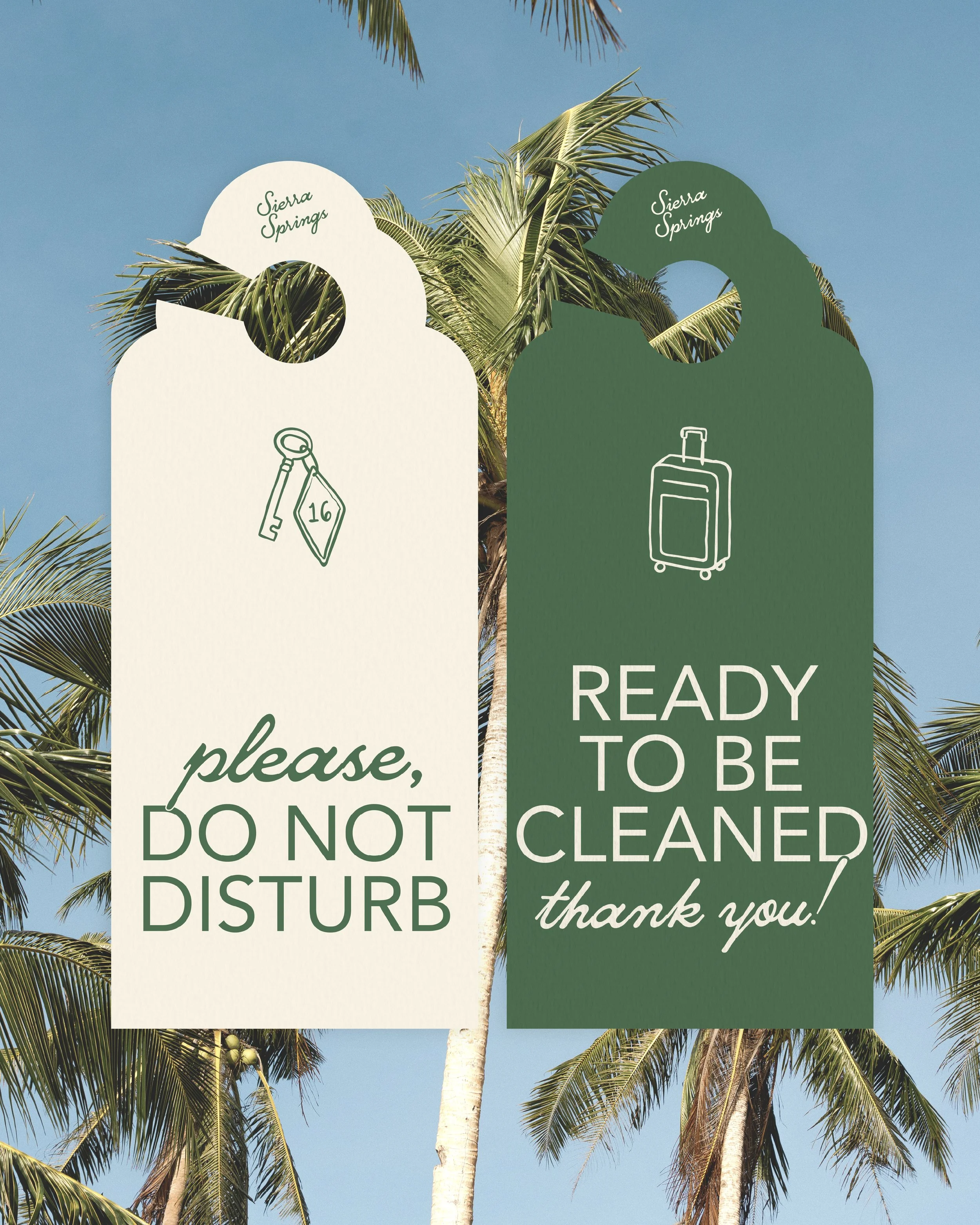
SIERRA SPRINGS
A playful, sun-soaked resort identity inspired by classic California road trips.
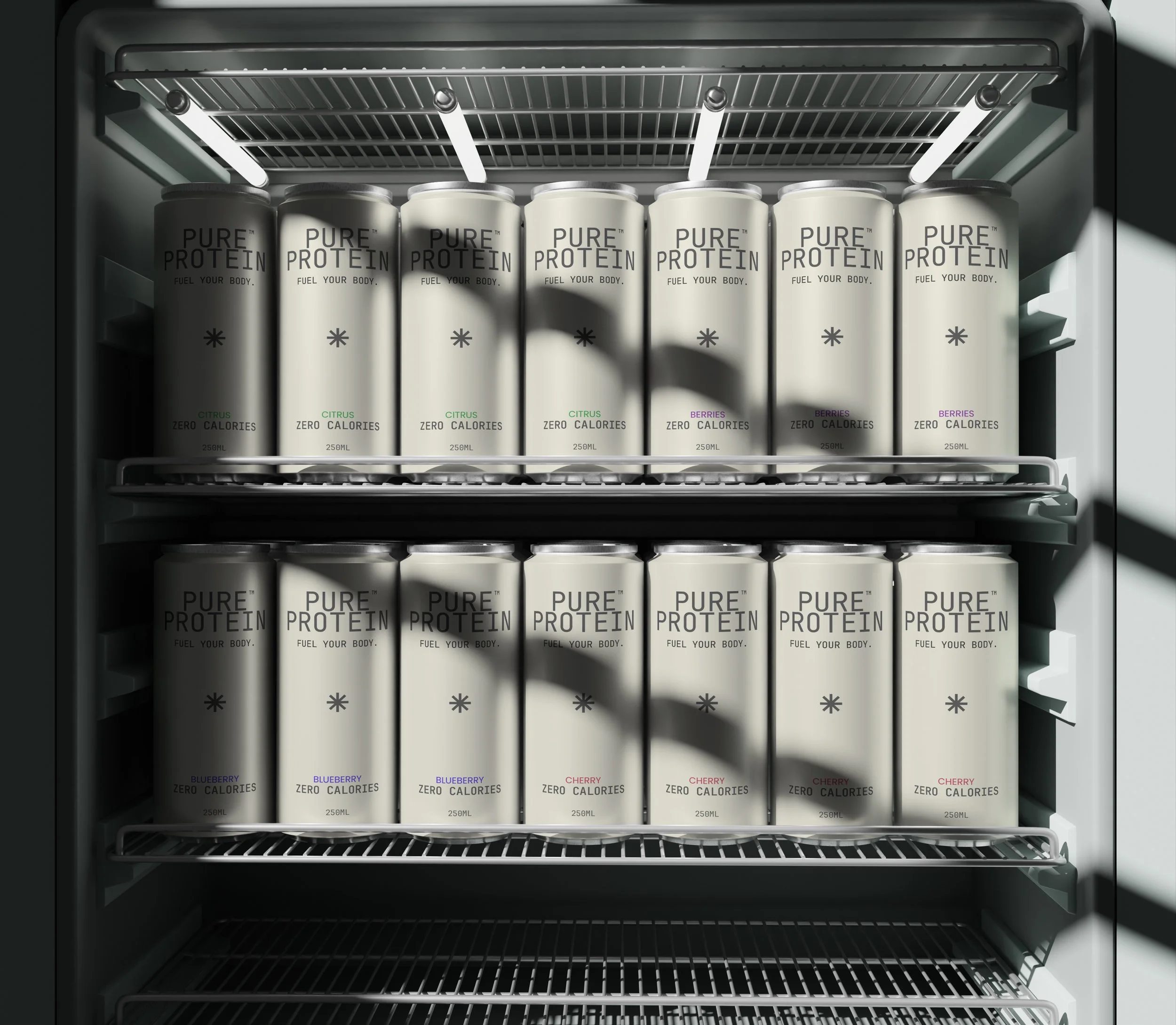
PURE PROTEIN
Functional fuel with a disciplined design language.
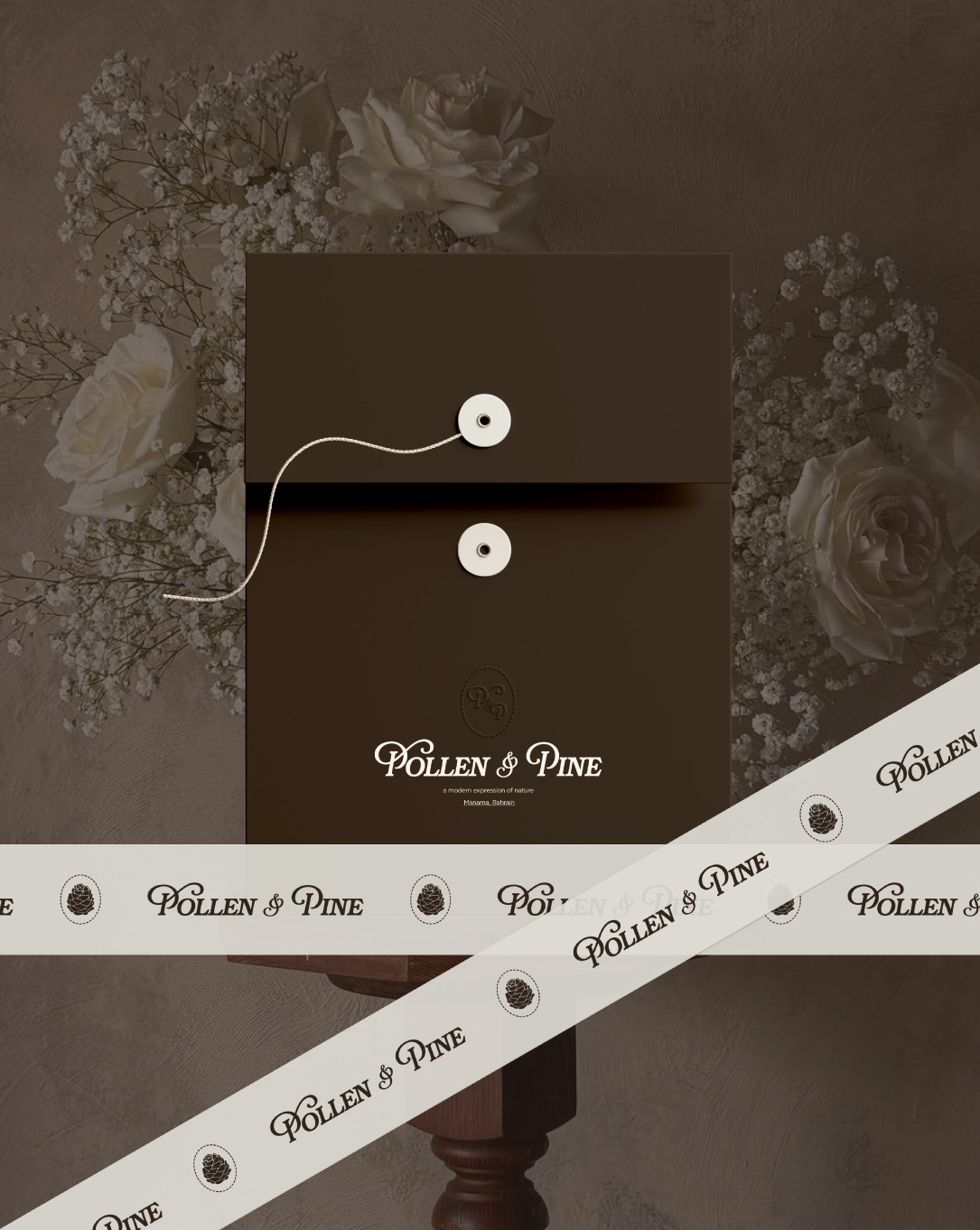
POLLEN & PINE
A little stationery magic to match your floral dreams.
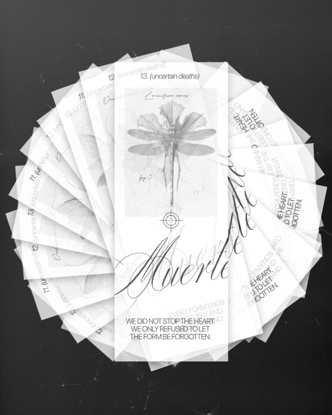
MUERTE
Where taxidermy becomes reflection, not pursuit.
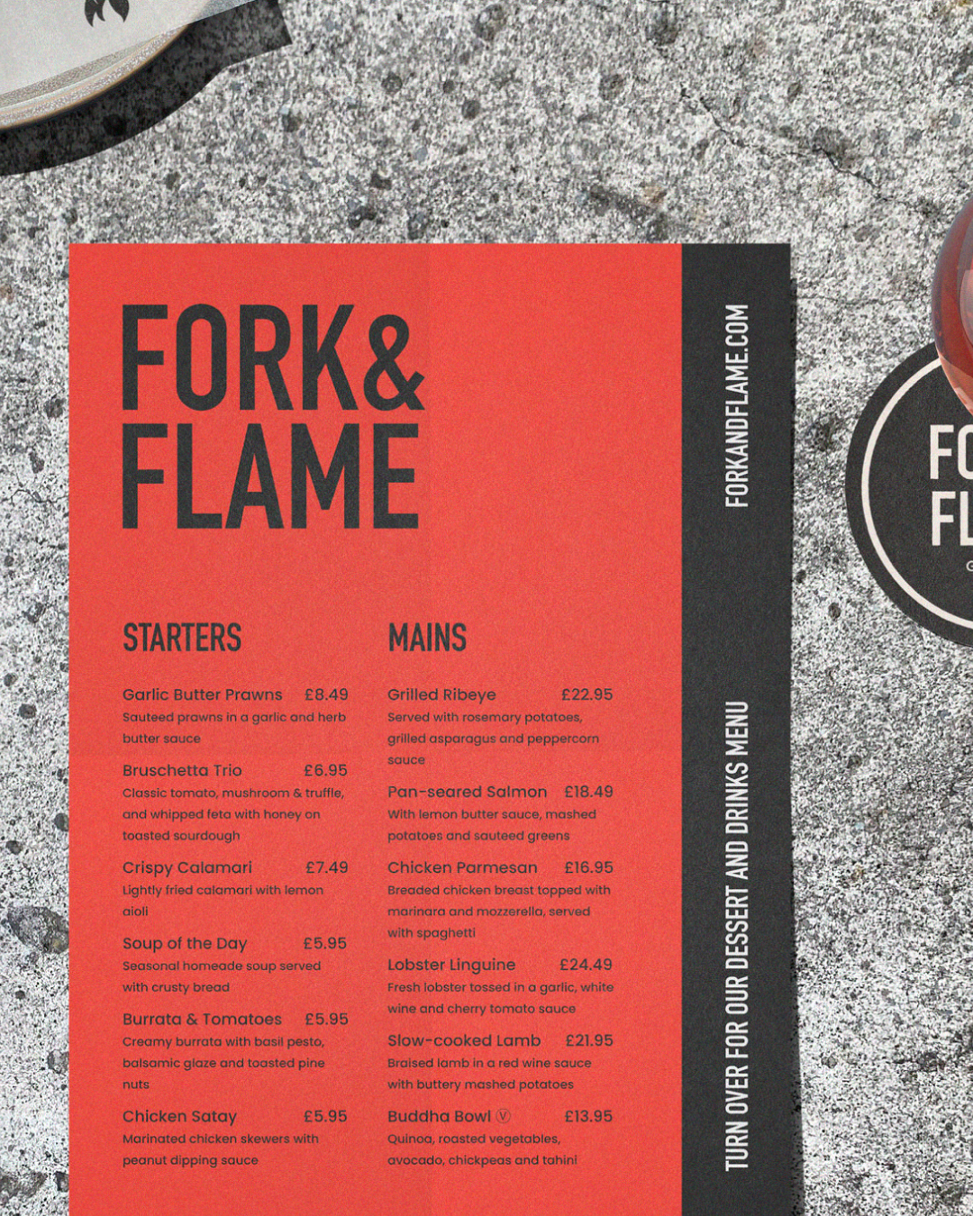
FORK & FLAME
Honest food, bold heat, good company.
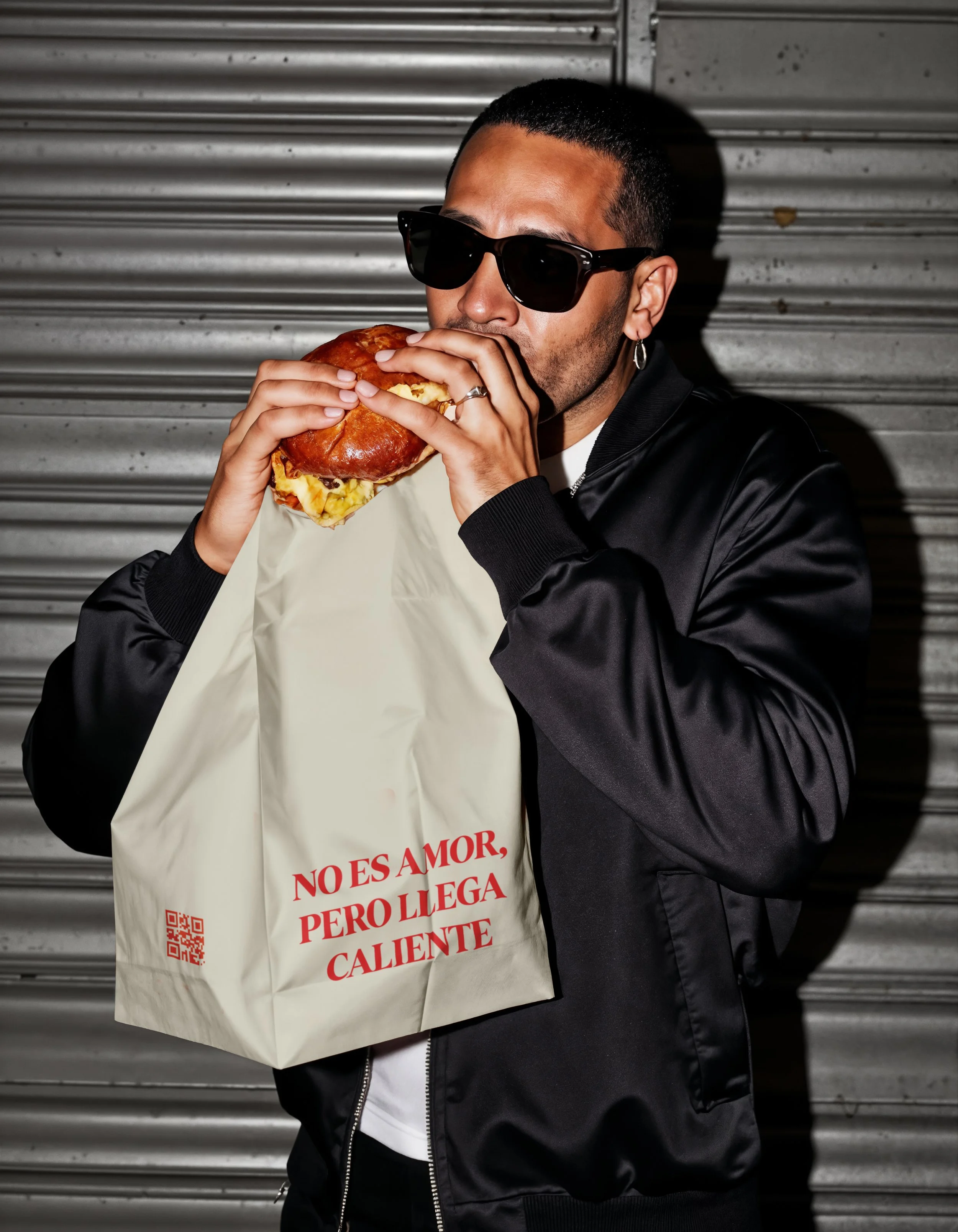
PUTOS MODERNOS
Unfiltered, nostalgic, and proudly Spanish.