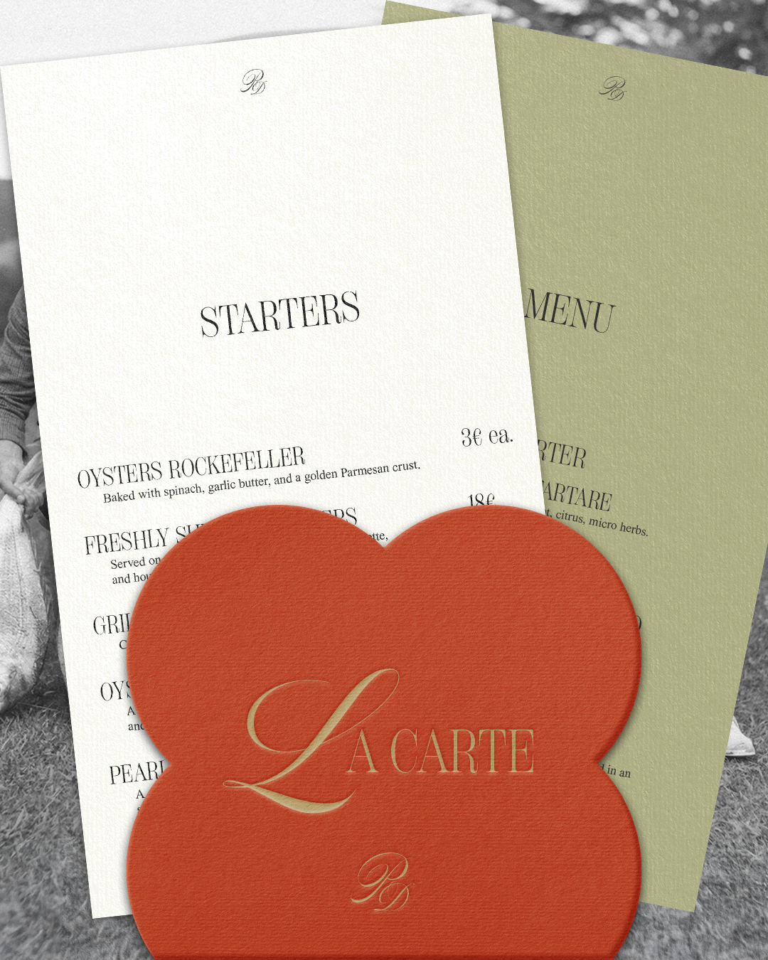
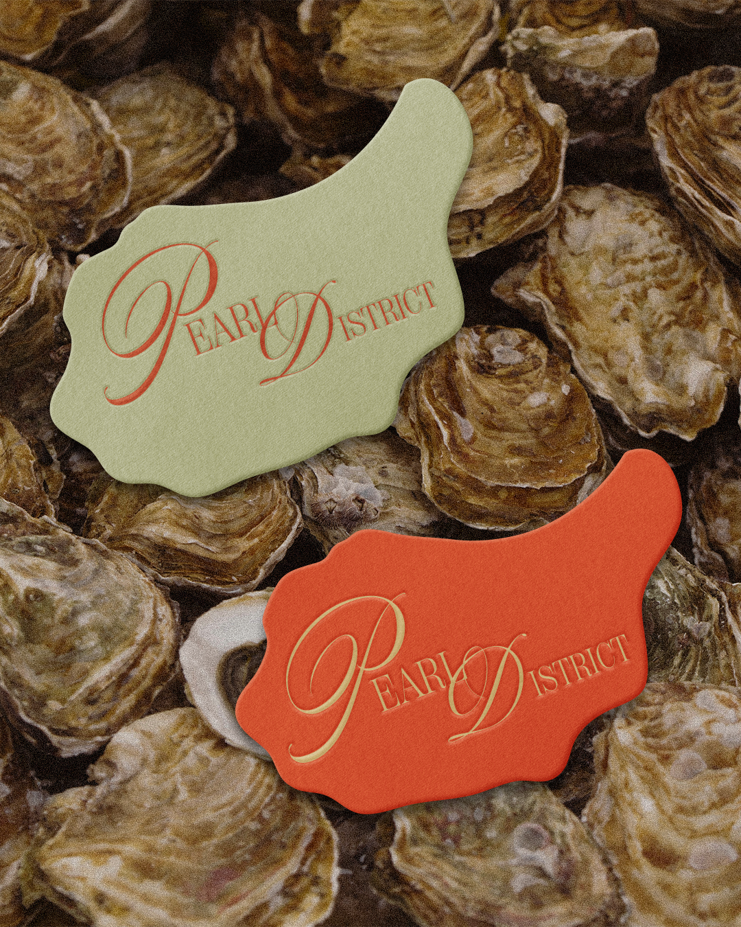
Pearl District is a refined oyster restaurant brand identity that embodies the elegance of fine dining by the sea:
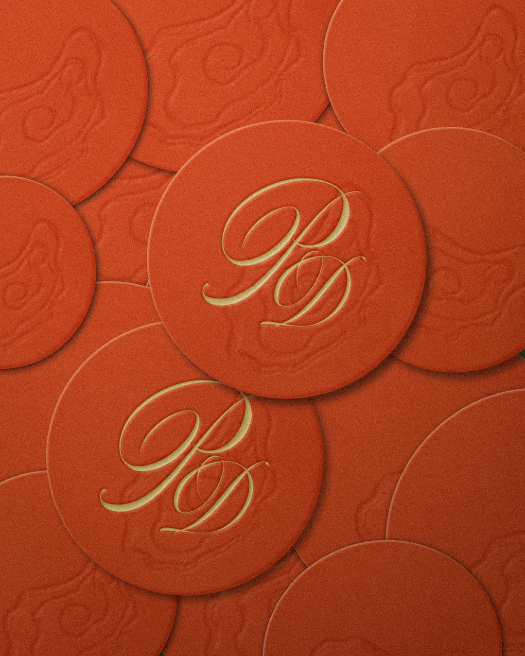
I’m always eager to learn and explore new aspects of graphic design, and lately I’ve been truly obsessed with textures; especially how paper textures, shading, and subtle glow can turn something flat into something tactile and elegant. This project became the perfect canvas to experiment and refine that passion.
Built on embossed detailing, and a rich palette of coral red and olive green, Pearl District’s identity balances modern sophistication with classic indulgence. From the delicately pressed menus to the embossed coasters every piece has been designed to give this elegant feeling a refined restaurant should carry.
This project showcases how texture and detail can elevate branding into a full sensory experience!
Pearl District


